O Globo – Subscription Journey Optimization
INDUSTRY:
Media & Publishing
COMPANY:
Globo
ROLE:
Product Designer (UX Research, Strategy, UI)
summary.
O Globo is one of the largest and most influential newspapers in Brazil, owned by Grupo Globo. The goal of this project was to investigate why users were not completing their subscriptions and to understand the key digital access patterns to both O Globo and Valor Econômico platforms.
Using data from Google Analytics and SimilarWeb, I discovered that over 70% of visits to Globo and competitor news platforms came from mobile devices — a critical insight that shaped the direction of our redesign.

challenge.
High drop-off rates in the subscription journey
Confusing pricing and inconsistent design across landing pages
Lack of trust due to poor UX and payment experience
Weak mobile performance and limited payment options
No differentiated strategy for new users vs. logged-in non-subscribers

goal.
Reduce friction and build trust in the subscription process
Benchmark competitors to identify UX and business gaps
Improve conversion by redesigning user journeys
Personalize the experience for different user types
Recommend scalable, cost-effective improvements
solution.
Mapped and compared subscription flows from key competitors (Exame, Folha, Estadão, UOL, NYT)
Identified UX best practices:
Clear CTAs on the homepage
Transparent pricing and benefits
Mobile-first journeys
Humanized support via WhatsApp
Recurring payment models (instead of full credit limit use)
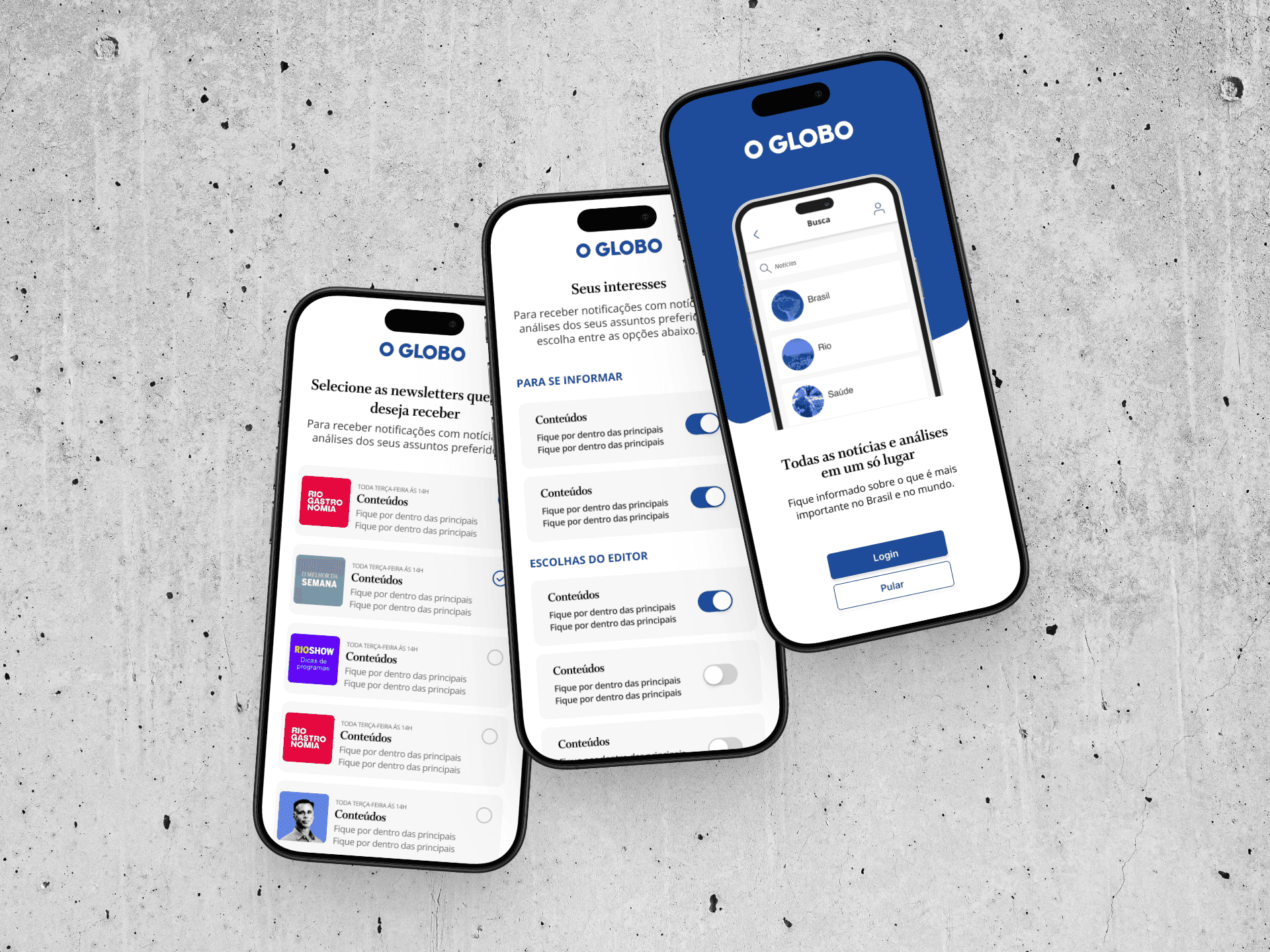
Conducted analysis of O Globo and Valor’s paywall logic
Proposed differentiated flows:
For anonymous users: highlight benefits of free registration
For logged-in non-subscribers: emphasize value of subscribing
Identified marketing gaps (e.g., weak email nurturing and lack of app promotion)

result.
Delivered actionable UX recommendations and redesign proposals
Created optimized flows for two key user states: non-registered and non-subscribed
Mapped key friction points that undermined trust and caused drop-offs
Aligned design strategy with business needs (payment models, mobile performance, and user trust)
💡 What I Learned
This project reinforced how critical mobile optimization and trust-building are in digital media products. Small changes — like consistent branding, simplified pricing, and transparent UX — can significantly reduce drop-offs. By combining data analysis with qualitative research, I helped the team uncover hidden pain points and propose user-centered, scalable improvements for both business and audience growth.